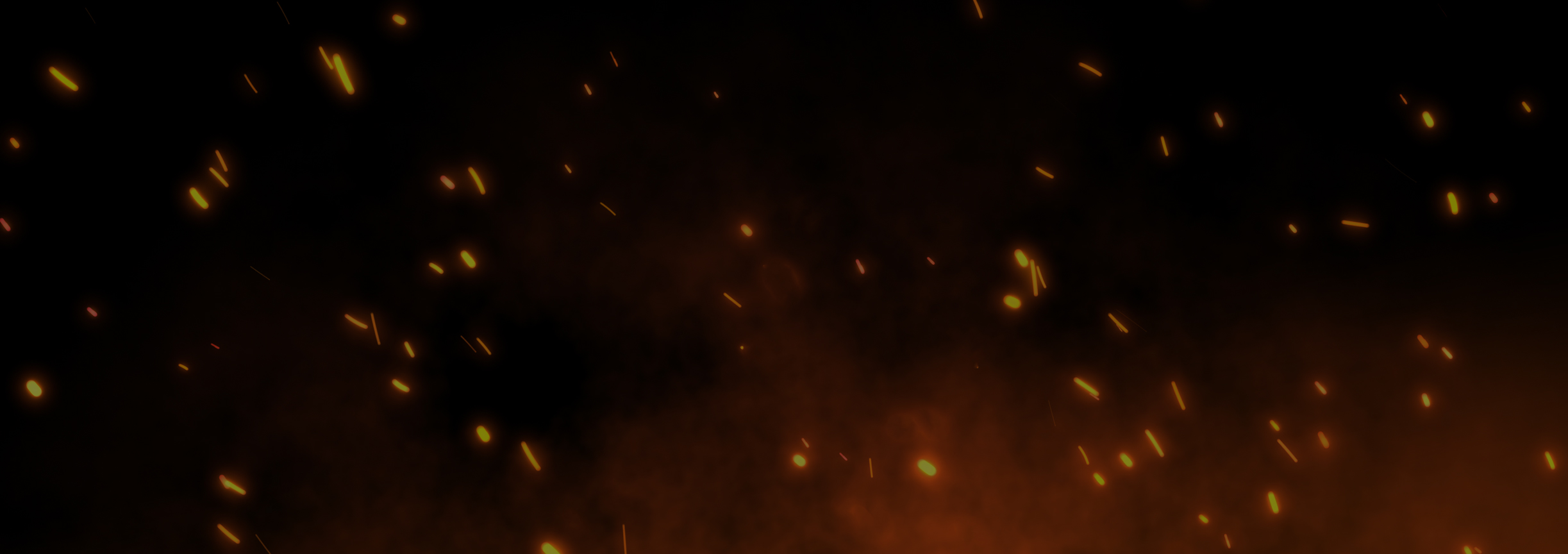

What color is horror? Perhaps what first comes to mind is, in fact, color’s opposite-the physical and figurative darkness of nighttime, shadow, death. But the genre also draws on the full chromatic spectrum to tell its tales. Most horror stories would be dull indeed without the pulse-quickening reds of blood and demons, the sickly greens of alien beings and rotting flesh, the hostile whites of winter landscapes.
It’s easy enough to understand how color packs a punch in image-based horror media such as film, illustration, and animation. But what about fiction? How can a non-visual form of storytelling make a visual phenomenon both vibrant and-the genre-specific burden of horror-disturbing? The long tradition of Gothic literature provides a wide array of answers to this question, and I’ll return to it often over the course of this essay series on color in horror for Tor Nightfire. This first article, though, will start at the (near-)beginning, with a focus on American horror fiction from the nineteenth and early twentieth centuries. Below, I dig into three short stories from that period, each of which exemplifies a broader strategy that authors use to frighten the reader with colors that she cannot, and will never, see.
Edgar Allan Poe’s “The Masque of the Red Death” (1842), Charlotte Perkins Gilman’s “The Yellow Wall-paper” (1892), and H.P. Lovecraft’s “The Colour out of Space” (1927) have more in common than their relatively early publication dates and U.S. authorship. All three works also reference a color in their respective titles, and rely on that color throughout as a pivotal source of scares. The chromatic stakes, then, are high for these tales. If the reader fails to find the hue in question at least somewhat unsettling, much of the story’s emotional payoff fails, too.
blank text
- The Organic Grotesque
The first and most formidable weapon in each story’s arsenal is one that draws its power from inborn human reactions to certain colors, using our biology against us. Specifically, Poe, Gilman, and Lovecraft locate their disquieting tints in the realm of the organic grotesque, banking on the instinctual disgust most of us feel when confronted with the decay or excessive growth of living things. In Gilman’s story, in fact, both decay and excessive growth come into play. The protagonist-narrator is driven mad by the deteriorating yellow wallpaper in her bedroom, a decoration whose design and tint she continually compares to a fungus that is simultaneously dying and proliferating wildly: “[the wallpaper] makes me think of all the yellow things I ever saw-not beautiful ones like buttercups, but old foul, bad yellow things…. imagine a toadstool in joints, an interminable string of toadstools, budding and sprouting in endless convolutions.”
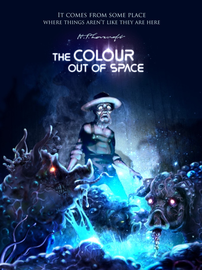
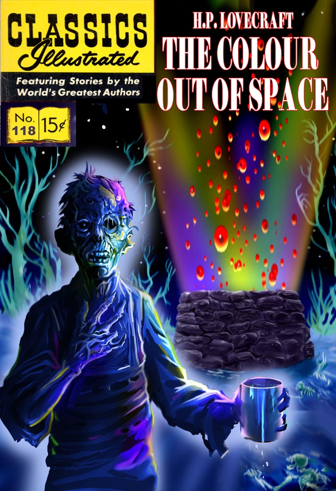
Lovecraft draws his kaleidoscopic terrors from a different biological kingdom-not fungi, but plantae. In “The Colour out of Space,” a meteor crashes to earth in rural New England, bringing with it an extraterrestrial hue that “infect[s]” everything it touches with a lethal “chromatic perversion.” Although animals and humans also succumb to the color, the story’s ickiest passages are arguably those which describe the overly fecund growth of color-contaminated plants. The Gardner family-note the name-soon finds that their “orchard trees blossomed forth in strange colours … [the] prismatic variants of some diseased, underlying primary tone.” The orchard’s fruits attain a “phenomenal size and unwonted gloss,” but this hyper-abundance ironically betokens disorder instead of health: “of all that gorgeous array of specious lusciousness not one single jot was fit to eat. Into the fine flavour of the pears and apples had crept a stealthy bitterness and sickishness, so that even the smallest of bites induced a lasting disgust.”
Of these three stories’ variations on the chromatic-organic, Poe’s offers up the most intuitive source of color-based scares: human illness. The eponymous disease ravaging an unspecified country in “The Masque of the Red Death” derives its name from “the madness and the horror of blood,” as the narrator writes, causing victims to ooze the stuff straight from the pores. The resultant “scarlet stains upon the body and especially upon the face” are also a scarlet letter avant la lettre (Hawthorne’s novel wouldn’t be published for another eight years), damning the sufferer to social exile. This malady, although fictional, is instinctually nauseating in large part because it is so very easy to imagine. Even if the reader has never watched someone bleed from the pores (and one very much hopes she hasn’t), she has undoubtedly seen blood spilled in her lifetime. In relying on the audience’s knowledge of the vulnerability of their own flesh (and on their guilty awareness of their own fear of other sick people), Poe gives his title shade a hideous immediacy.
blank text
2. The Synesthetic Imagination
The human body also serves as the reference point for a second strategy by which these authors make hues more potent on the page. This technique, best exemplified by Gilman’s story, describes a color in terms of one or more of the other four senses. “The Yellow Wall-paper” dwells especially on smell and touch:
… there is something else about that paper-the smell! … [W]e have had a week of fog and rain, and whether the windows are open or not, the smell is here. It creeps all over the house …. It gets into my hair …. I wake up in the night and find it hanging over me …. A yellow smell.
This passage intentionally mixes different forms of sensory input such that they associatively build upon and strengthen one another. I may not be able to instantly call to mind the shade of yellow that Gilman describes, but I can imagine the sickly odor of paper that’s been damp for a week, and how soggy-dreadful that paper would feel against my skin-and these two descriptions, in turn, evoke a particularly vile shade of yellow.
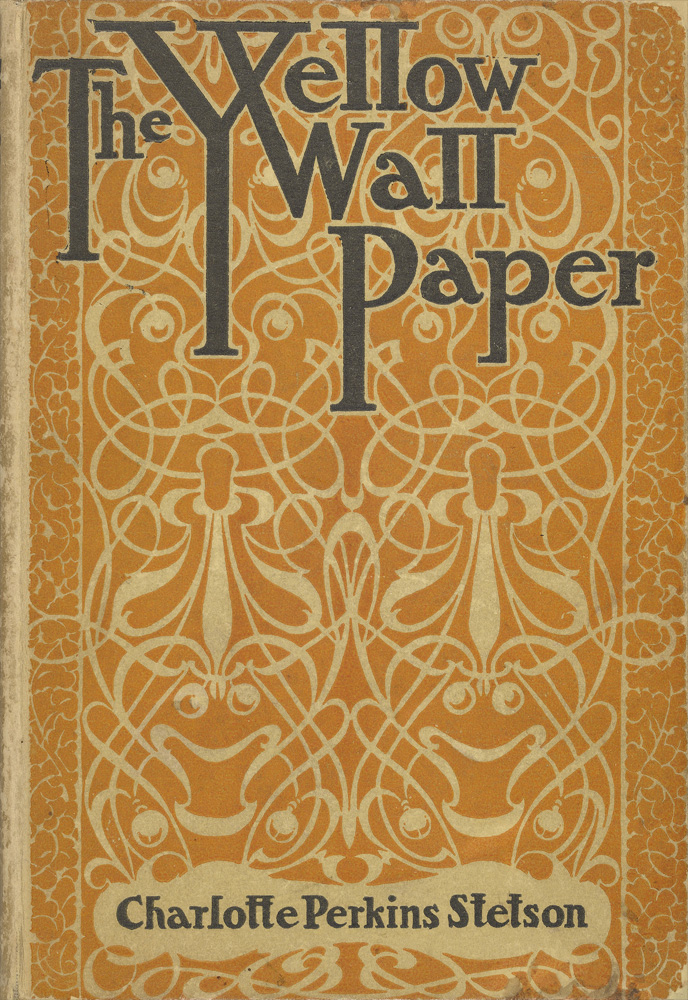
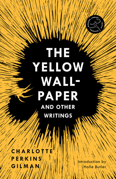
But the other unsettling dimension of these lines is the way in which they blur the senses together, a yellow sight becoming a yellow odor becoming a yellow touch. Synesthesia, here, is a kind of violation, generating an atmosphere of sensory overwhelm, even persecution: the narrator is vulnerable to the dreadful color through every perceiving organ. (Synesthesia again functions as a bodily invasion later on, when the color rubs against the narrator’s skin a second time: “[my sister-in-law] said that the paper stained everything it touched, that she had found yellow smooches on all my clothes and [my husband’s].”)
blank text
3. Symbolic Resonance
“The Masque of the Red Death” makes its written hues more forceful by piling on not the other senses, but the ominous resonances of preexisting color symbolism. This is true both of the titular color itself and of the shuffled rainbow of rooms of the abbey in which the main character, King Prospero, hosts a rager in the middle of the Red Death pandemic. Each chamber is outfitted in a single color: proceeding from east to west, like the sun, they are bedecked in blue, purple, green, orange, white, violet, and finally, black.
These monochromes receive so much descriptive space and are so mysteriously ordered that they beg to be read allegorically; as G. R. Thompson writes, among “the favorite pastimes of critics is trying to identify the symbolic meaning of the colors of the seven rooms.” One of the more plausible interpretations suggests that Poe was drawing on color theory from the mid-1800s, and particularly the work of Frenchman Frédérick Portal. Under this aesthetic framework, the single-hued rooms of the masque trace a movement from life to death, the blue tints of the soul’s pre-existence in heaven eventually giving way to what were considered deathly hues-white, violet, and finally black. For a nineteenth-century reader fluent in these color associations, the story’s endpoint is chillingly clear as soon as the chambers are described. We may be about to witness a display of liveliness in the form of Prospero’s celebration, but the darkness of death waits for us all at the end, just like the red-garbed plague that soon penetrates and lays waste to the party (including the prince himself, who dies in the black chamber).
Only a handful of these colors’ symbolic attachments remain the same in present-day America, primarily black’s funereal undertones. Violet’s association with death, or blue’s with birth, on the other hand, gets lost in chronological translation for the contemporary reader. What Poe’s story also illustrates, then, is the degree to which a color’s ability to frighten us can wane or even reverse entirely over time as its cultural connotations shift.
blank text
4. Anti-description
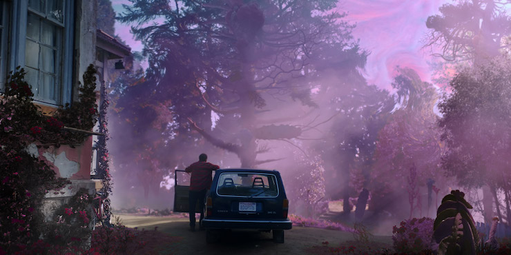
A final strategy for rendering colors on the page is to refuse to render them at all. Those familiar with Lovecraft’s work will recognize this technique-some would say tic-as one that recurs throughout his oeuvre: a character experiences something so visually (or sometimes aurally) bizarre that he insists he cannot capture it on the page. In “Colour out of Space,” such anti-descriptions take the form, e.g., of passages about “strange colours that could not be put into any words,” that are “beyond all Nature as we know it,” and whose “unrecognizable chromaticism” is “unlike any known colours.” This is as concrete as the story gets with regard to the hue in question. Little wonder, then, that of the five directors who have adapted the story for film, only two have chosen the same part of the rainbow (purple) to represent the eponymous color.
As not a few readers have noted, there’s an irony to dedicating entire paragraphs to descriptions of a thing’s indescribability. Lovecraft’s aesthetic offenses are also often paired with moral ones, and we should be wary of any narrative about color that comes to us by way of a man who was an appalling racist by any era’s measure. (The latter point will be the full focus of a subsequent essay in this series.)
But this particular story nonetheless suggests an intriguing paradox about the seeming problem of painting with words: it is only through non-visual narrative that one can in fact preserve the full strangeness of an unseeable color. Pictorial adaptations of “Colour out of Space,” which include the aforementioned films, as well as book covers and comics, must definitively select one or several ROYGBIV frequencies for the invading hue in question (unless they opt for grayscale, as several creators have). The moment such visual interpretations give the viewer a color she can see, they erode some of the color’s alienness. Many reviews of Richard Stanley’s recent cinematic adaptation of the story expressed this particular feeling of letdown:
“It wasn’t like any color I’d ever seen before,” explains a dazed New England patriarch, trying to describe the unearthly phenomena at the center of Color Out of Space. Such an assertion might work in “The Colour Out of Space,” the 1927 story by H.P. Lovecraft, whose work oozes with mysteries that can’t be fully comprehended or even perceived. But viewers of the movie have already seen the unearthly hue by the time it’s so described. It’s purple.
By refusing to pigeonhole its extraterrestrial color, the raw text of Lovecraft’s story gestures towards a terrifying, and very real, mise-en-abyme: there are, at this very moment and in the room where you sit, a mind-bogglingly high number of light frequencies that your eyes cannot perceive. But imagine the blinding rainbow that would result if you suddenly could. Colors don’t even need to come from outer space to point our minds towards dizzying vistas of infinite perception.
This post was written for Nightfire in partnership with Pseudopod.


One thought on “Color in Horror: The Grim Rainbow of American Gothic Fiction”